Role
Lead UX/UI Designer
UX Researcher

Overview
Launched in 2017, TYMLOS is an osteoporosis treatment developed to stimulate bone formation for patients at high risk of fractures. Despite its effectiveness and convenience, field research revealed that most patients were unaware of the brand and its benefits.
As part of a larger brand overhaul, we set out to redesign the TYMLOS patient site to improve content accessibility, highlight TYMLOS’s unique mechanism of action, and create a compelling user experience that would help increase engagement and conversions, ultimately motivating patients to consider treatment.
As the UX lead, I collaborated with a team of creatives, developers, and product managers to define site architecture, wireframe key pages, develop high-fidelity prototypes, conduct usability testing, and oversee the site’s launch.
Problem
How might we enhance the patient site to better inform patients about bone-stimulating treatments like TYMLOS and its unique benefits?

Key Findings
Content Organization Challenges: Users struggled with navigating the app due to a single, long-scrolling “Browse” page and insufficient filtering and sorting features, making it hard to discover specific workouts.
Missing Features: The absence of workout tracking and improved filtering/sorting capabilities emerged as the most requested features, hindering user engagement and efficiency.
Navigation Difficulties: Many users found it challenging to locate videos and navigate through categories, limiting their overall experience.
Competitive Gaps: Competitor platforms offered key strengths (e.g., filtering, tracking, engaging design) but also revealed opportunities to differentiate, such as simpler navigation and less cluttered interfaces.
Define
The top priority need was clear: a better way to discover content and track workouts. With that in mind, I defined a set of goals and principles to guide an improved experience redesign.
Goals
Enhance Content Discoverability: Simplify navigation and introduce filtering and sorting options to help users find workouts quickly and efficiently.
Introduce Workout Tracking: Enable users to track completed sessions and progress directly within the app.
Centralize Scheduling Features: Replace external PDFs with an in-app calendar for easier access to workout plans on the go.
Incorporate Best Practices from Competitors: Adopt effective elements from competitor apps like dashboard screens and scheduling features while avoiding common pitfalls like cluttered interfaces
Principles
UX Analysis
Analysis of the current app to uncover usability issues and pinpoint opportunities for improvement.
User App Review and Social Listening
Analysis of user reviews across various platforms to understand broader user sentiments and challenges
User Survey
Conducted a survey of 47 active TSS members to get direct feedback on specific questions and more nuanced feedback.
Competitive Audit
Audited three competitors: Peloton, Obe Fitness, and Melissa Wood Health to identify white space opportunties
Develop
App Architecture
The insights from user research and the content inventory guided the development of the information architecture.
Layind down the foundation
We created elegant packaging for HydraLips' lip balm, featuring soft colors and floral illustrations, enhancing shelf appeal and reflecting the brand's quality. Our digital strategy included a website overhaul and social media redesign, maintaining a cohesive brand image. Comprehensive guidelines were established for consistent branding across all platforms.

Design
Wireframes
I started exploring initial concepts on paper then moved to Figma to create mid-fidelity wireframes with more detailed design and interactive elements. I focused on:
Redesigning key screens (e.g., Home, Dashboard, Signature Classes, Workout Video).
Visualizing layout new features such as filtering, sorting, and a progress tracker.
Improving content organization and layout while maintaining the app's familiar visual design to align with user preferences.
Additionally, I considered technological constraints that I may have faced if this were a real project such as the design limitations it would have as a Vimeo-hosted platform
Testing & Refinement
Navigation was unclear in some areas
Before
The CTA button alone read as a link to learn about how the drug worked vs the pen.

After
Revised CTA to be more specific about taking TYMLOS

Scrolling animation was not noticeable
Before
Users did not notice how the callouts animated in as they scrolled down the page
Use static image of injection pen, saving development time and costs
Pop-up was not well-received by most users
Before
Users found pop-up to be intrusive and annoying and most wanted to know more before signing up for anything.
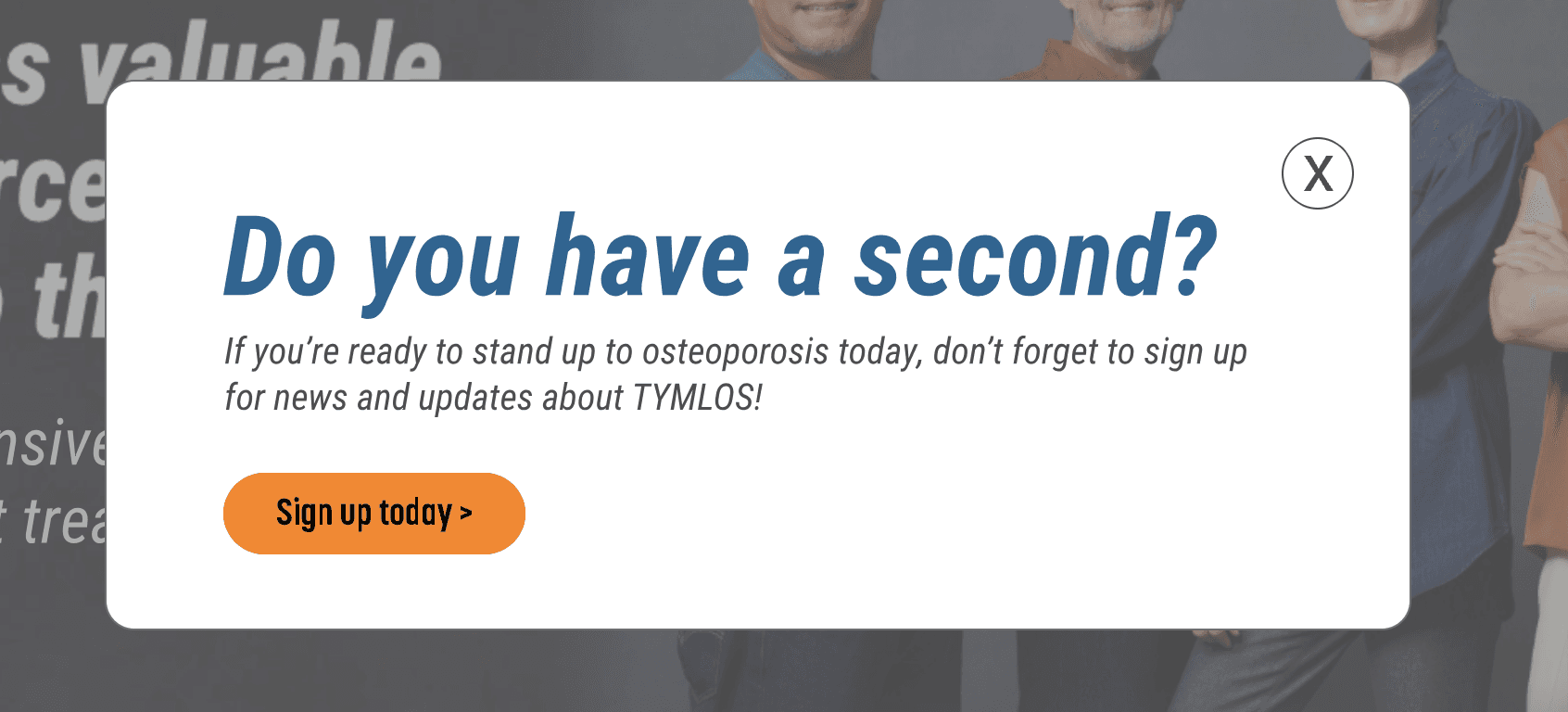
After
Due to client’s desire to implement it, monitor analytics to see if users dismiss vs sign up then determine whether it should stay on the site or not
CTA copy was unclear
Before
Because all of the registration CTAs used slight different copy, most users didn't realize that they all led to the same registration page.


After
Due to client’s desire to implement it, monitor analytics to see if users dismiss vs sign up then determine whether it should stay on the site or not
Dev Collaboration

Launch
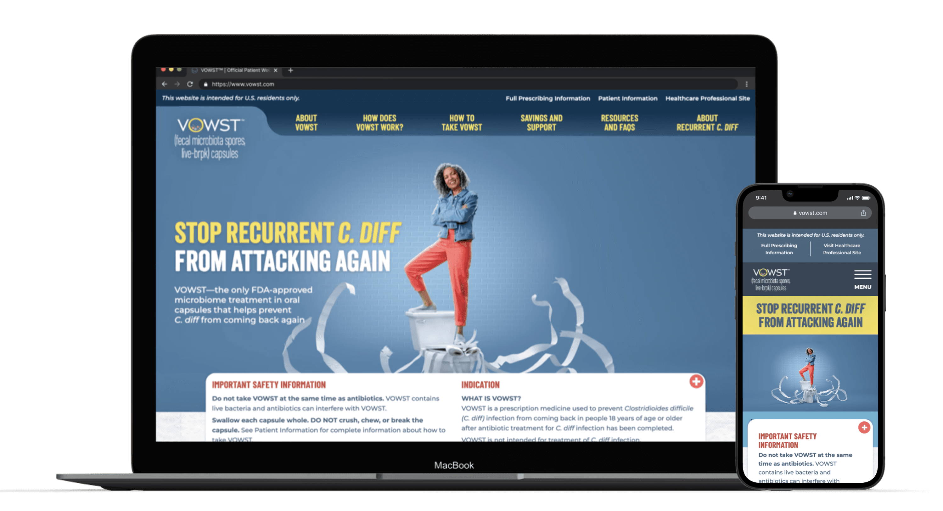
The redesigned site went live on November 15, 2023, with a new look and content to educate patients on osteoporosis, highlight TYMLOS benefits, and provide resources to encourage doctor discussions.
You can view the live site at tymlos.com.
Please note it’s continuously updated, so it may differ from this case study.

A streamlined journey from the start
Home page greets patients with the new “Add to the bone” campaign setting a tone of confidence and defiance against osteoporosis and invites the users to further explore the site using strategic crosslinks that offers the most relevant information that the user may want to know and also addresses the business strategy.
A clearer story for Why TYMLOS
Patients get to know the primary __ that sets TYMLOS apart from other treaments, it’s mechanism of action. Then learn about how well it really works. The tabbed area provides easy access to both women and men’s clinical data, another differentiator of TYMLOS. With the pinned functionality offering the easiest way to switch between both.
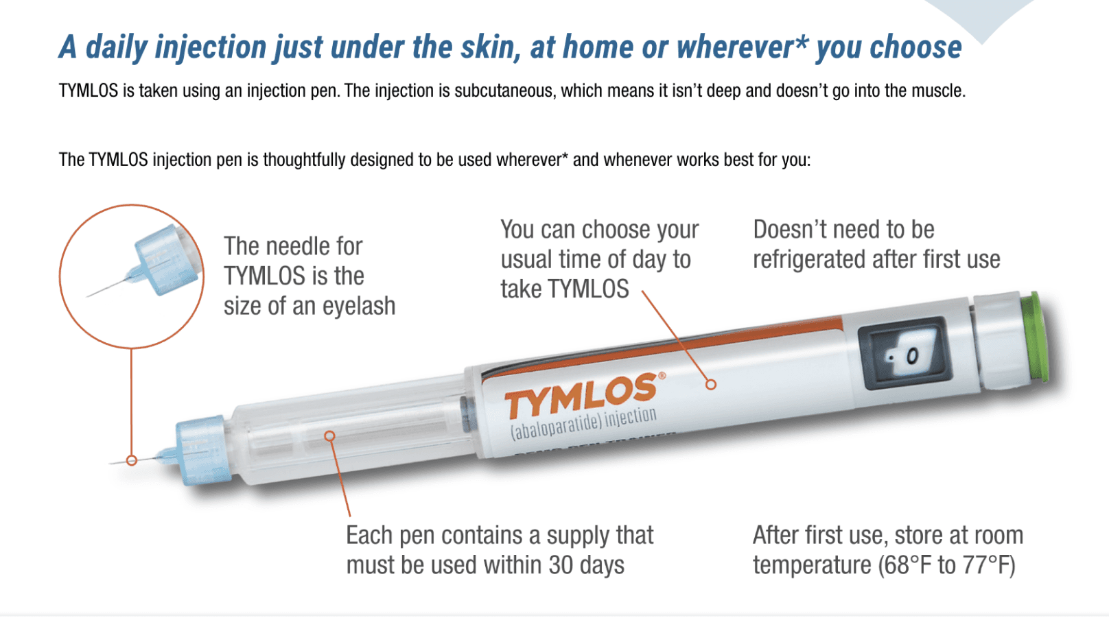
Portraying the injection pen as something to celebrate, not fear
Overview of all the resources and support offered shown on one page. Depending on what support you need –– treatment related or access/savings related –– you know exactly where to go to get more information on either.
Ample resources, organized by need
Overview of all the resources and support offered shown on one page. Depending on what support you need –– treatment related or access/savings related –– you know exactly where to go to get more information on either.
Impact
30%
Engagement Rate
>30 S
Engagement Time
3x
Conversion Rate
Reflection
Learning
Challenges
Timeline and budget constraints limited us to one usability test, restricting revision validation. Still, we maximized insights by integrating user and messaging research from the discovery phase.