THE SCULPT SOCIETY
Redesigning a mobile fitness app to improve workout discovery and motivation
My role
Product design
Research
Strategy
Timeline
2022
Skills & tools
User research, competitive audit, information architecture, wireframing, prototyping, UI design Figma, Indesign
Product
Mobile app
Before
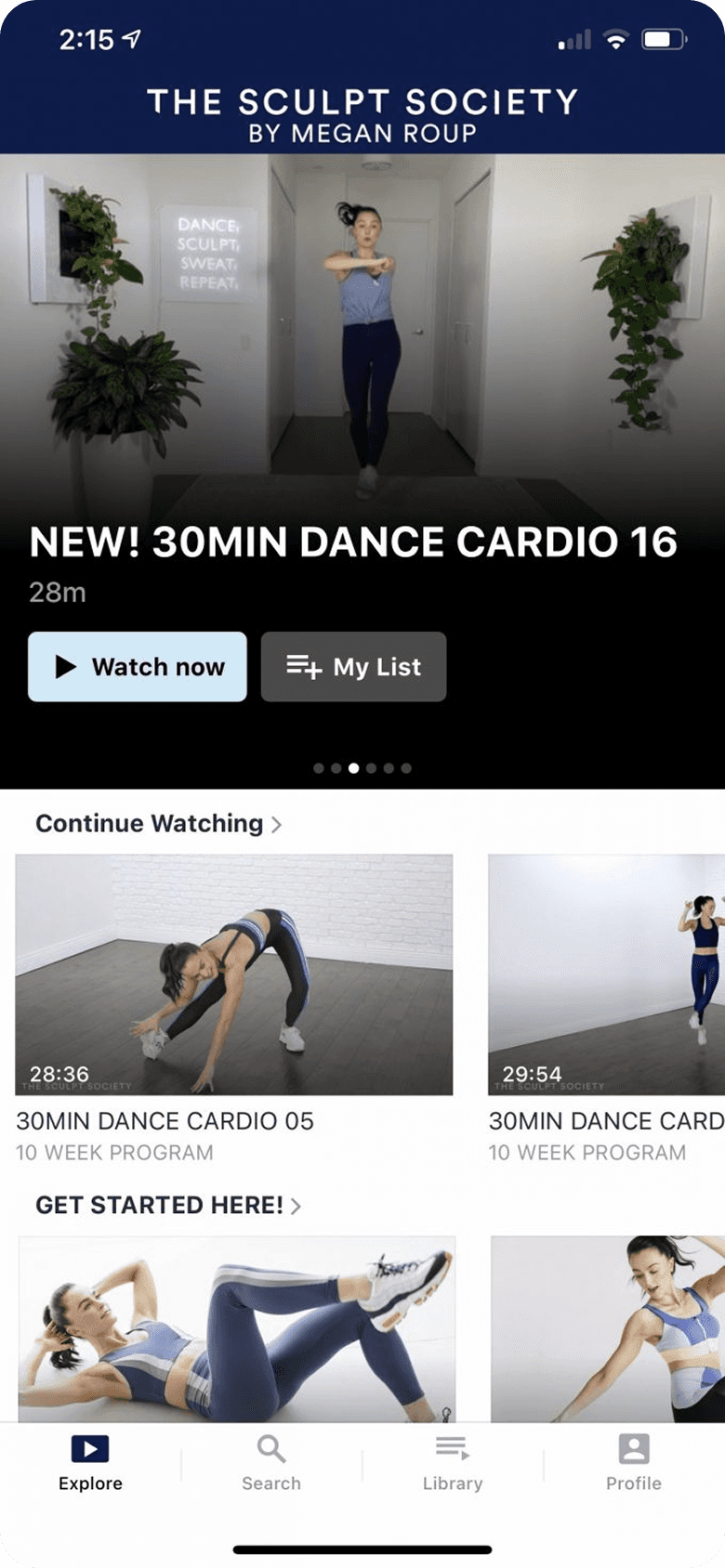
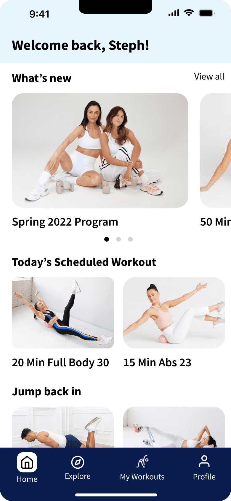
After
Long Story Short
The Process
Empathize & Discover
Discovering user needs and pain points to inform the redesign
To get a deeper and broader understanding of user needs, challenges, and potential areas for improvement, I used a comprehensive research strategy combining an app analysis, user feedback review, user survey, and competitive benchmarking.
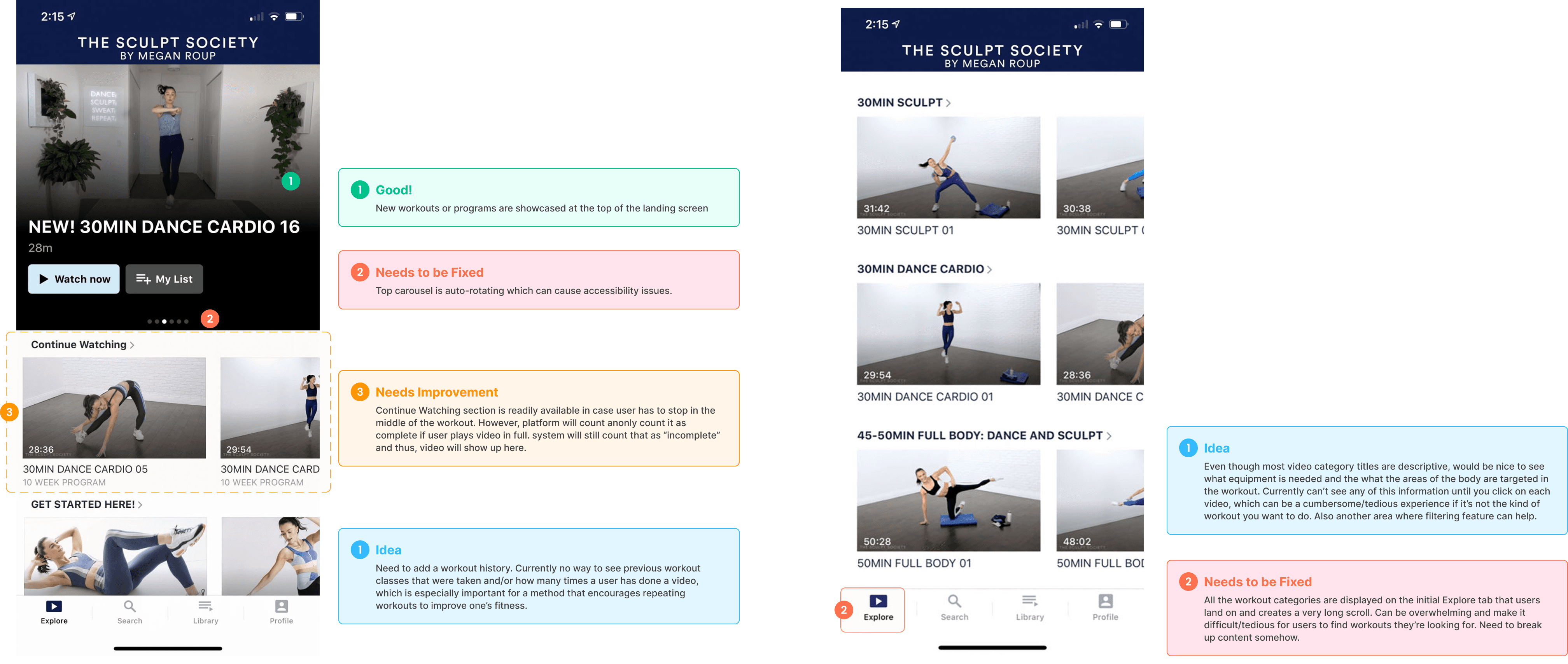
App analysis: identifying structural barriers
Goal: Identify usability issues inhibiting workout discovery and engagement.
Key Findings:
Poor content organization – Most workouts were buried in a long-scrolling “Explore” page, making finding workouts tedious and difficult.
Limited discovery tools – Absence of filtering or sorting capabilities meant users couldn't efficiently find workouts matching their needs or preferences.
Missing workout tracking – Users couldn't log completed sessions, missing a key motivational element.
Inconvenient access to program schedules – Workout calendars were only available as PDFs, limiting on-the-go access.
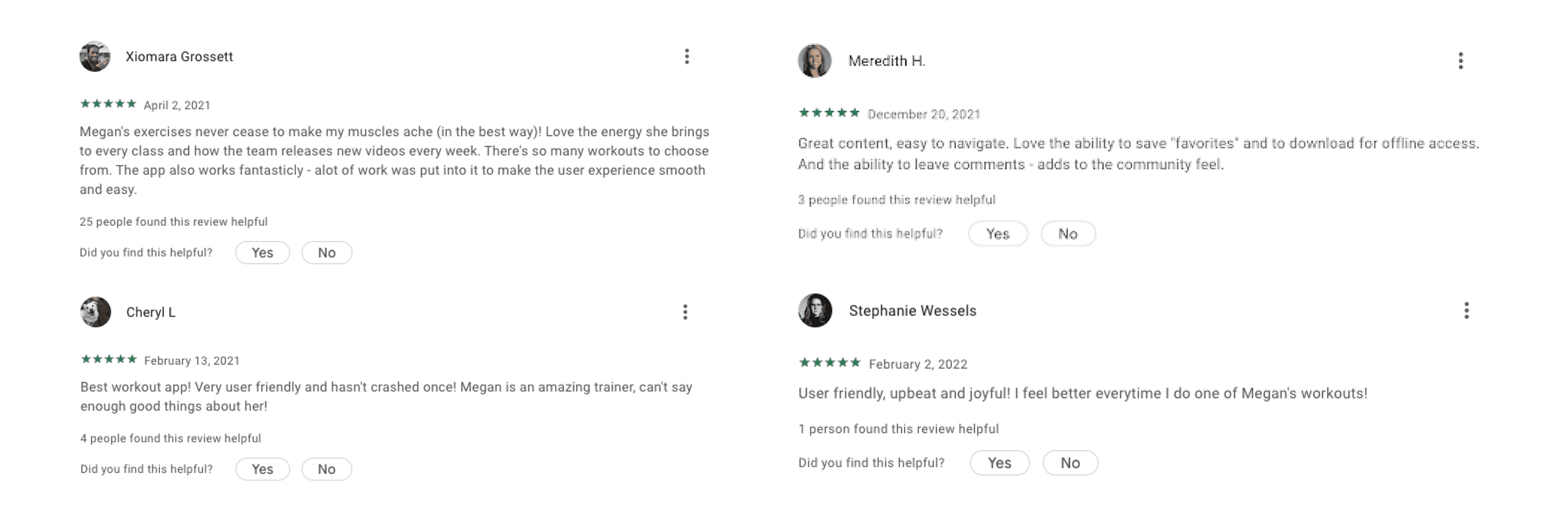
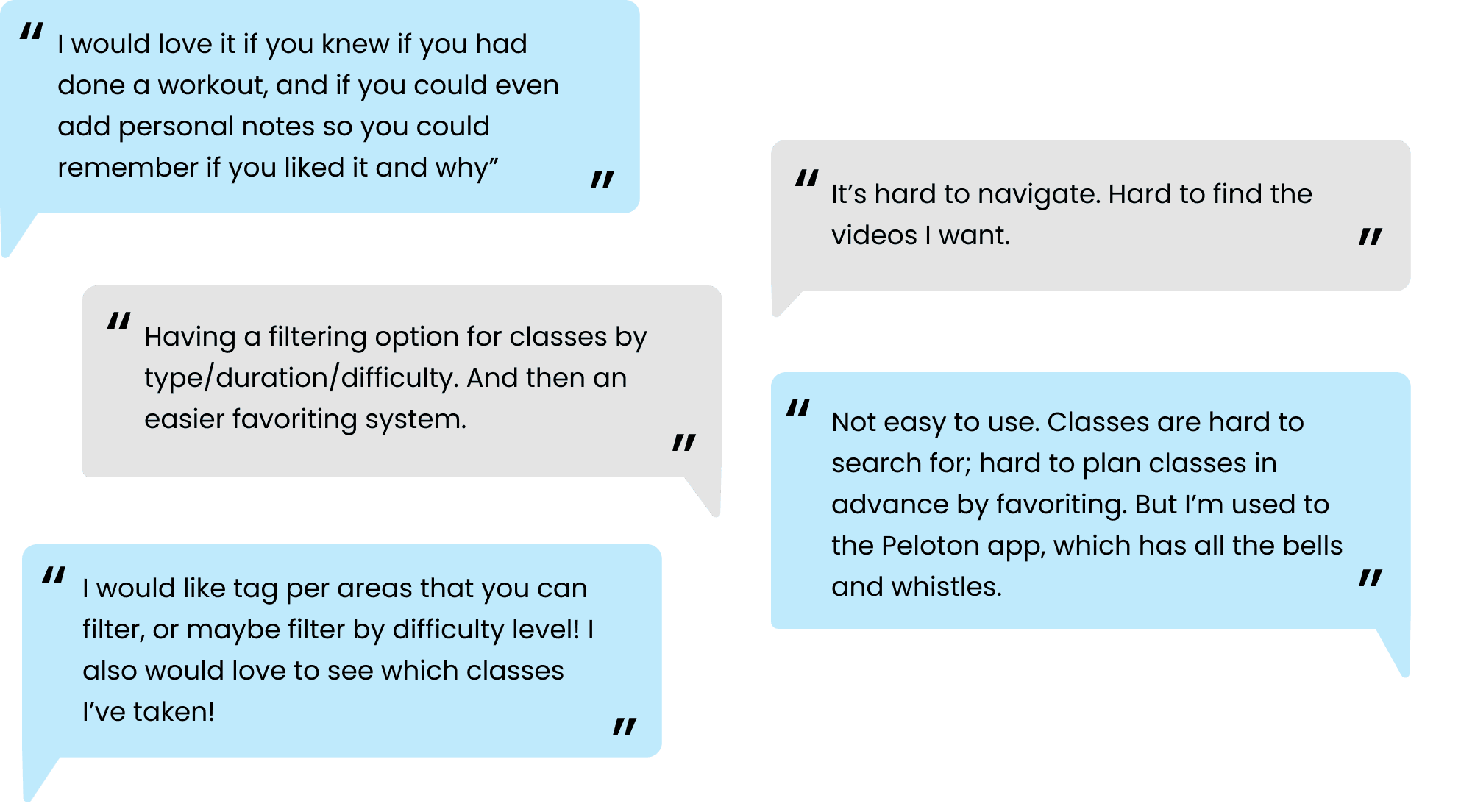
User sentiment analysis
Goal: Gather real-world user feedback from reviews on Apple App Store, Google Play, and social media to identify common frustrations and feature requests.
Key Findings:
Users consistently praised workout content quality but expressed frustration with the discovery experience
Users frequently requested for workout tracking and better filtering/sorting.
Confusion around content organization.
User survey with 47 members
Goal: Identify usability issues and improvement areas to guide the redesign.
Key Findings:
Poor content organization – Most workouts were buried in a long-scrolling “Browse” page, making discovery difficult.
No filtering or sorting – Users struggled to find specific workouts efficiently.
Lack of workout tracking – No way to log completed sessions, reducing engagement.
Inconvenient access to schedules – Workout calendars were only available as PDFs, limiting on-the-go access.
Competitive audit: learning from industry leaders
Goal: Assess strengths, weaknesses, and opportunities compared to top competitors.
Competitors Analyzed: Peloton, Obe Fitness, Melissa Wood Health

Competitive matrix
Key Findings:
Peloton: Easy navigation with a clean design, though nested tabs can be a bit cumbersome. The filtering tool helps users quickly find workouts from various instructors. Overall, it's user-friendly and packed with features like progress tracking and community interaction.
Melissa Woord Health: Easy navigation with a clean design, though nested tabs can be a bit cumbersome. The filtering tool helps users quickly find workouts from various instructors. Overall, it's user-friendly and packed with features like progress tracking and community interaction.
Obe Fitness: Easy navigation with a clean design, though nested tabs can be a bit cumbersome. The filtering tool helps users quickly find workouts from various instructors. Overall, it's user-friendly and packed with features like progress tracking and community interaction.
DEFINE
Research synthesis
I used affinity mapping to synthesize research findings and define actionable goals and design principles. The core need was clear:
How might we make it easier for users to discover, choose, and track workouts so they can stay engaged, motivated, and consistent in their fitness journey?
Goals
Improve content discoverability – Simplify navigation and introduce filtering/sorting to help users quickly find workouts.
Enable workout tracking – Allow users to log sessions and monitor progress within the app.
Integrate scheduling features – Replace static PDFs with an interactive in-app calendar.
Support independent selection – Design for users who prefer to choose workouts on their own.
Leverage competitor strengths – Incorporate best-in-class patterns while avoiding common usability pitfalls.
Principles
Keep it Simple
Prioritize clean layouts and reduce cognitive load.
Empower Users
Give users control with personalized dashboards and intuitive exploration.
Functional Elegance
Combine strong usability with visual appeal aligned to the TSS brand. (This is a UX focused redesign)
Provide room to grow
Design for scale and adaptability.
Develop
Simplified an overwhelming workout library by restructuring content around user goals
I started with a basic content inventory and mapped out the app’s current architecture to grasp the organization and variety of workouts and features. This process revealed redundant or unclear class categories and highlighted areas for content reorganization and simplification.

Current information architecture w/ main screens and example workout selection flow
Then, incorporating the insights from user research I redesigned IA structured around key user goals: discovering, scheduling, and completing workouts. I consolidated content-heavy sections and streamlined navigation into four primary areas: Home, Explore, My Workouts, and Profile.

Redesigned information architecture w/ main screens and example workout selection flow.
Develop
Wireframing core screens to bring the IA to life
Once the site architecture was in a good place, I started exploring initial concepts on paper then moved to Figma to create higher fidelity wireframes. I focused on wireframing the main key screens (Home, Explore, My Workouts) and screens for the primary flow of finding and selecting a workout.

Home - full scroll

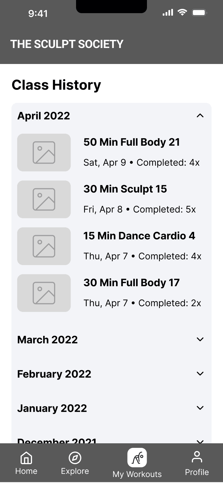
My Workouts: View/manage schedule, class history, saved and downloaded classes (left) and Class History screen (right)
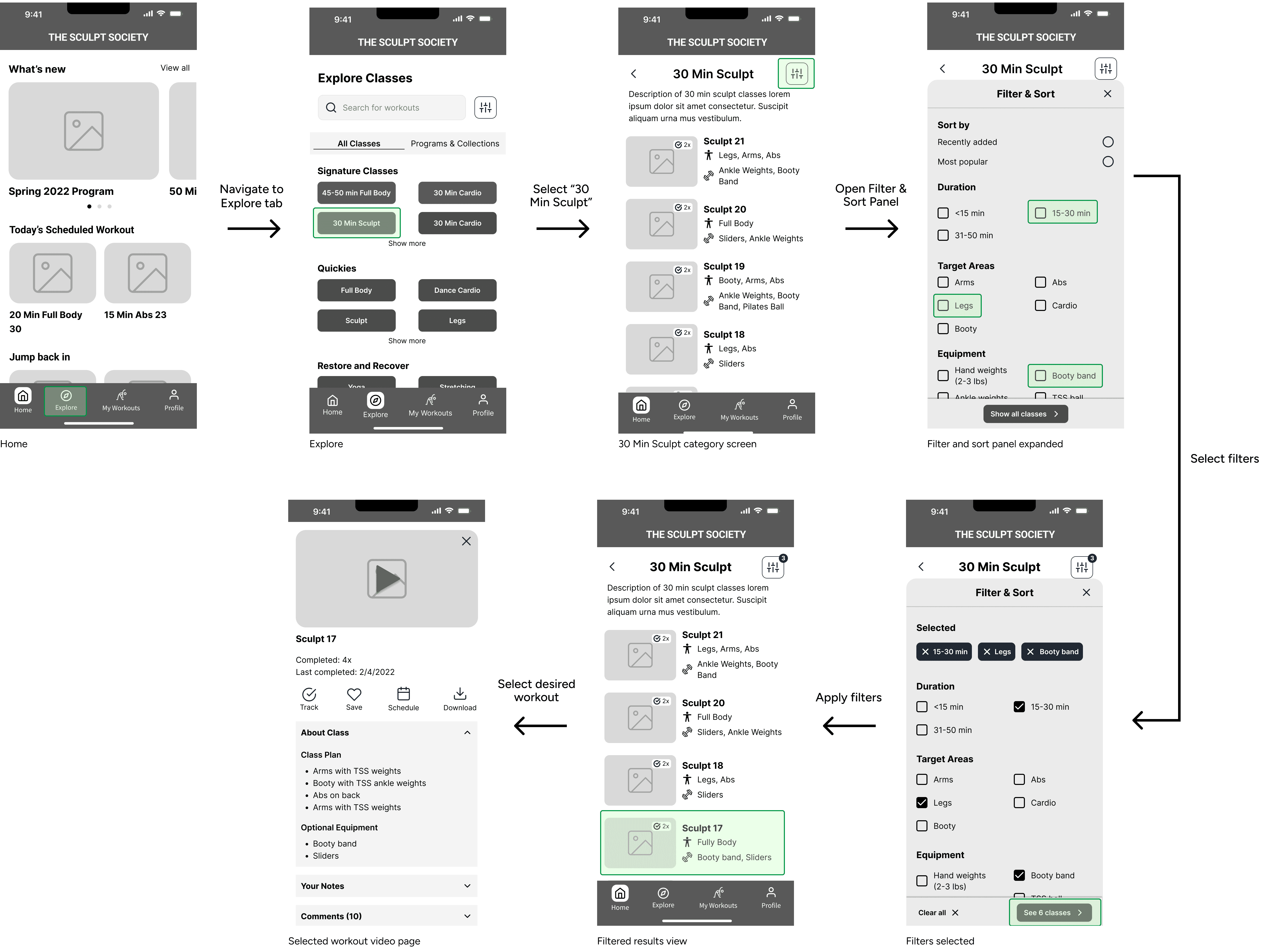
Primary flow: Finding workouts using filters
Deliver
Introducing an experience that makes working out easier, not harder
By the end of the four months, I conducted comprehensive user research to identify and prioritize user needs. Using these insights, I improved content organization and navigation, implemented a filtering and sorting feature, and designed a dashboard for tracking and scheduling workouts. I created a mix of high-fidelity wireframes and wireframe prototypes as final deliverables for my redesigns.
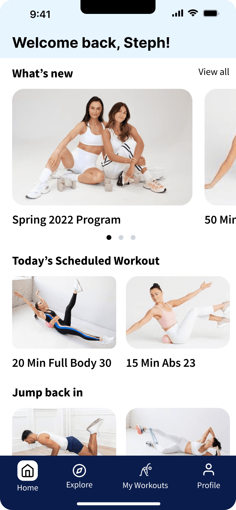
Reimagined Home screen with quick access to relevant content
The simplified home screen gives users quick access to new and personalized content like their scheduled workout(s) of the day, in-progress programs, weekly live workouts, and new workouts of the week, essentially acting as a discovery screen.
This gives users access to more relevant content instead of inundating them with a full workout library, helping reduce the cognitive load and hopefully increasing their engagement.
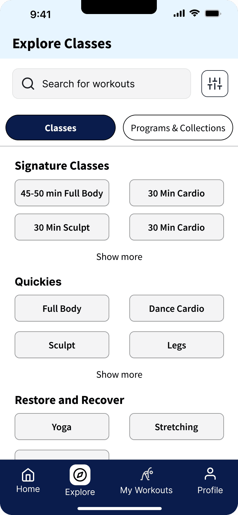
Streamlined Explore interface to enhance content discovery
Research showed that users found it tedious to navigate the extensive Explore page and find desired workouts.
Within the redesigned Explore screen, users can:
Browse for individual workouts with clear categorization
Search for classes if they know what they're looking for
Access programs and collections if they want something more structured
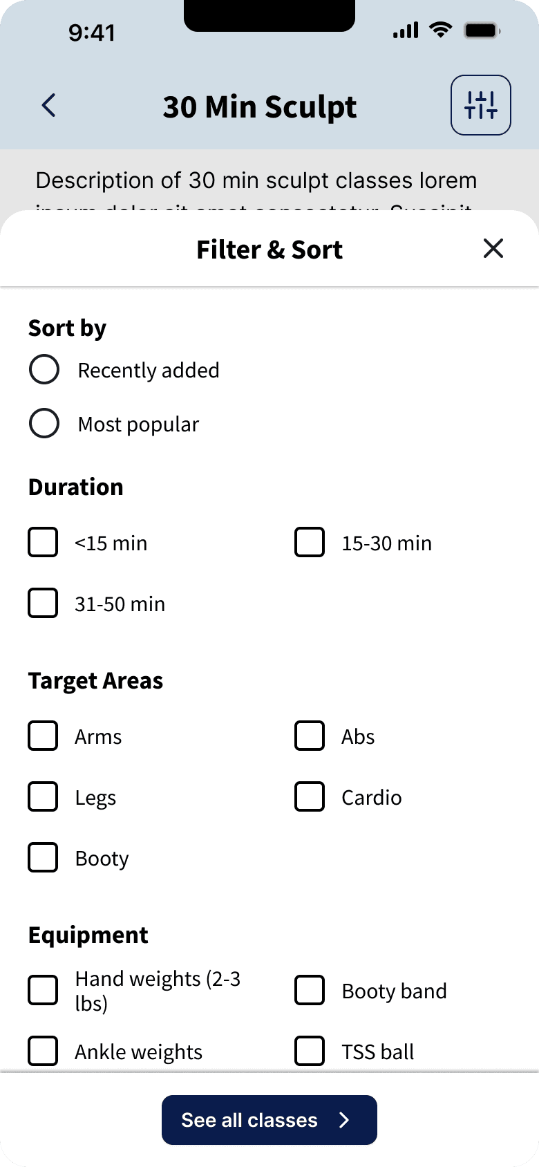
Filtering and sorting for more efficient and precise workout selection
With the current app, users couldn't efficiently find workouts to meet their specific needs, equipment, or time constraints, often having to sift through lengthy descriptions to find the right workout.
The new filter & sort feature allows:
Multi-variable filtering by duration, equipment, target area, trainer, and completion status.
Relevant sorting options by popularity, difficulty, and recency
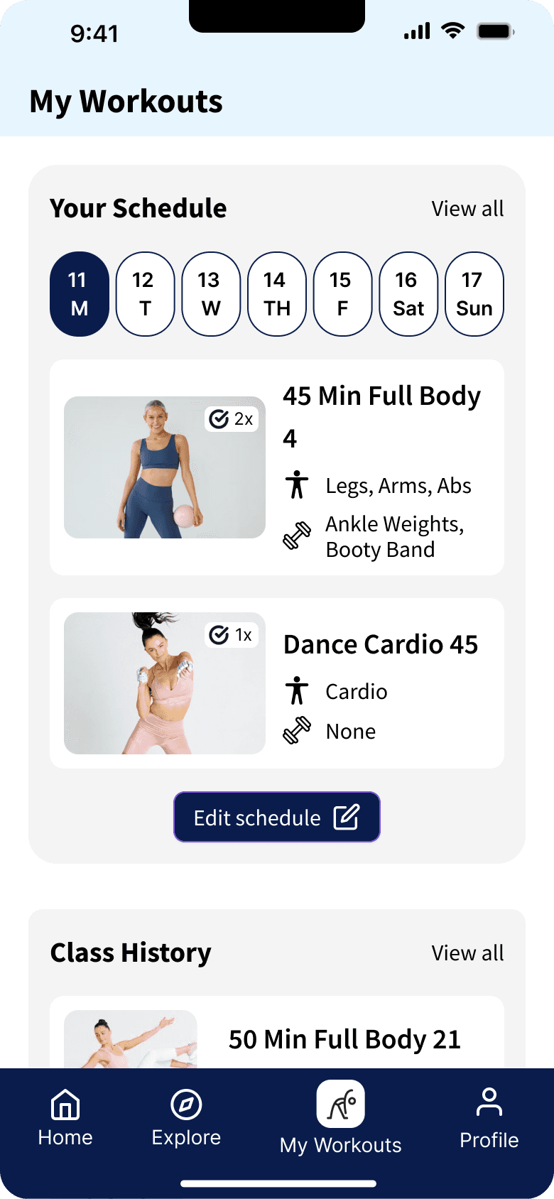
My Workouts dashboard to help track progress and plan workouts
One of users' most common pain points was the inability to track the progress and completion of workouts.
The My Workouts screen houses all things personalized to the user, such as:
Interactive calendar where they can view their schedule and plan their workouts
Workout history with completion data and access to notes from previous sessions
Favorited and downloaded workouts for quick access
Reflection
Learnings
Mobile-First Thinking Transformation
I learned a lot about mobile app design through this project and allowed me to become more familiar with mobile interaction design patterns. Unlike websites with more predictable user flows, mobile apps require designing for contextual, often interrupted usage patterns.
Constraint-Driven Innovation
Through this project, I learned valuable lessons about incremental improvement versus complete overhaul. By focusing on immediate structural and functional enhancements around workout discovery and tracking vs focusing too much on visual redesign, I was able to:
focus on solving for the most common usability pain points (most people were okay with the app’s visual design)
reduce potential user friction by maintaining similar branding and language (e.g., workout and category labels)
This experience reinforced that meaningful UX improvements don't always require visual reinvention—sometimes the most impactful changes happen beneath the surface.
Challenges & Growth Opportunities
Project Management
Taking on this side project revealed areas for my professional growth. Without structured timelines, I occasionally fell into perfectionism traps, spending excessive time on certain features at the expense of overall progress.
In my next project, I plan to:
Set time-boxed periods for each phase of the process
Create milestone check-ins with clear deliverables
Use the MVP concept before refining details (e.g., I think I could have performed a quick user test with the initial information architecture)
I hope to learn from this experience to become a more efficient designer who can better balance thoroughness with practical momentum.
Balancing Scope & Detail
The comprehensive nature of a full app redesign sometimes felt overwhelming, especially when considering edge cases and feature interactions.
I plan to create clearer problem boundaries and use more prioritization frameworks (Impact Effort matrix) to improve my ability to deliver high-impact solutions without scope creep.
