My role
Lead UX Designer
Duration
7 months
Client
Seres Therapeutics Nestle Health Science
Skills & tools
Site architecture, wireframing, prototyping, Figma, Axure RP
Product
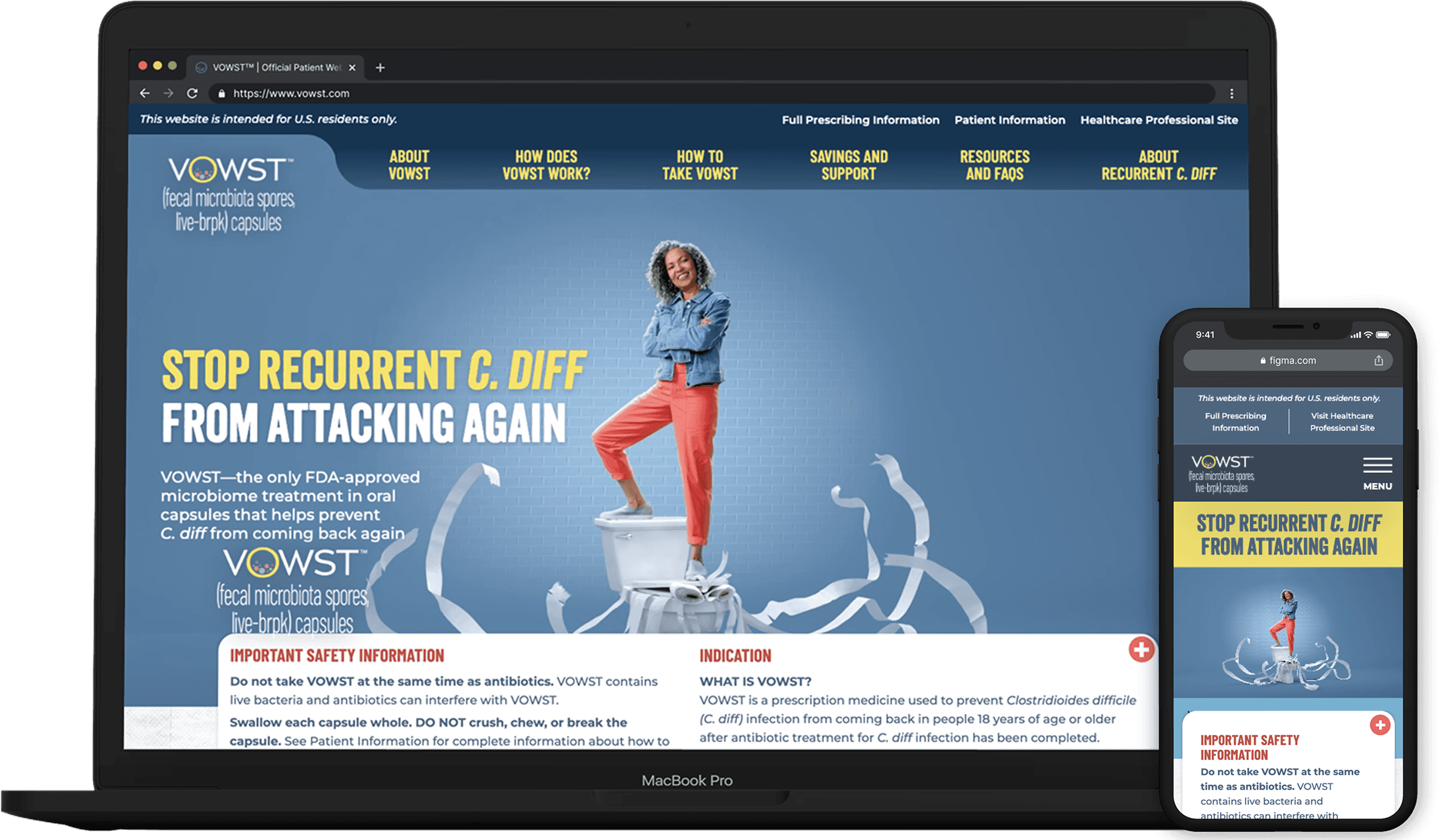
Responsive website
Long Story Short
Context: In April 2023, Seres Therapeutics received FDA approval for VOWST—the first and only oral microbiome therapeutic for recurrent C. diff infections. As a first-in-class treatment, patients finally had access to a breakthrough therapy that offered convenient oral administration through a capsule. However, VOWST represented uncharted territory in both medicine and marketing.
The Challenge: Design the patient website for the launch of VOWST to educate prospective patients, build trust, and drive enrollment.
How do you build confidence in a medical treatment when no one has seen anything like it before?
My Role: Lead UX Designer responsible for site architecture, wireframes, prototypes, usability testing, design documentation, and overseeing implementation.
Unique Constraints: High-profile launch of a first-in-class drug required rapid, precise execution while navigating ambiguity, tight timelines, and strict regulatory constraints.
Results & Impact
23K
site visits
52%
engagement rate
7%
conversion rate
2,800
patient enrollment forms
>2000
patient starts
The Process
UNDERSTANDING
User insights and market research informed my design approach
Key Insights
Patients lacked trusted information of the disease state
Recurring infections left patients desperate and considering unsafe treatments
Gaps in provider care and communication led patients to seek answers in support groups
When patients with recurrent C. diff want to find credible treatment information and regain control over their health, so that they can break the cycle of reinfection and return to normal life.
Using these insights, the team was able to develop the overall website strategy and objectives.
Website strategy: Educate patients and drive activation
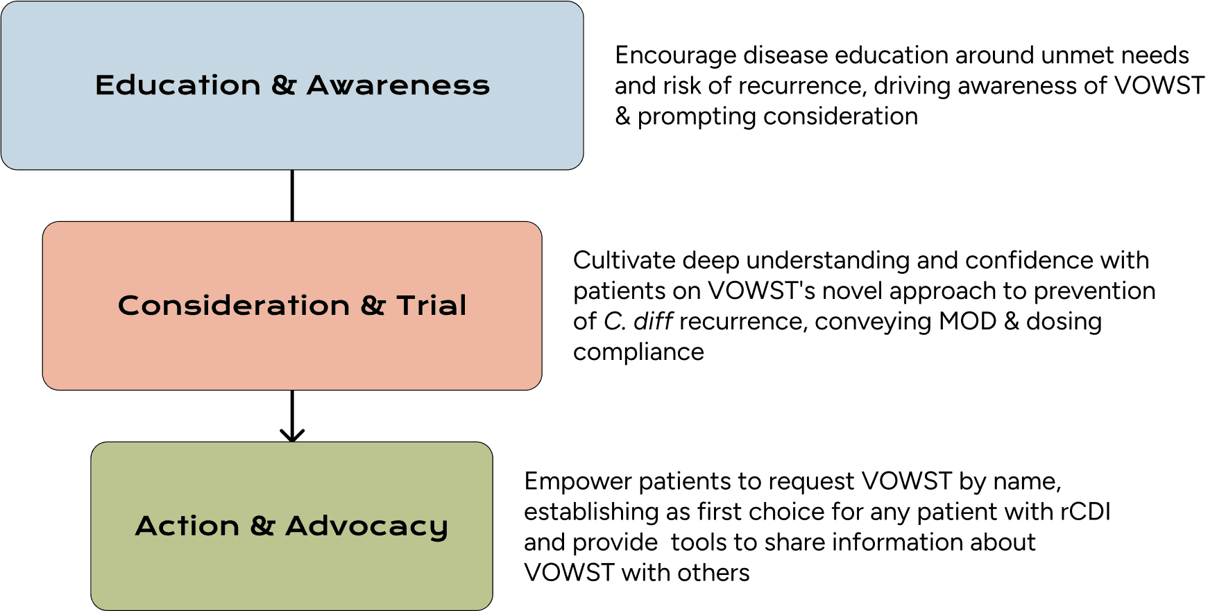
Three key objectives based on website strategy to educate patients and drive activation
SITE ARCHITECTURE
Creating structure in ambiguity
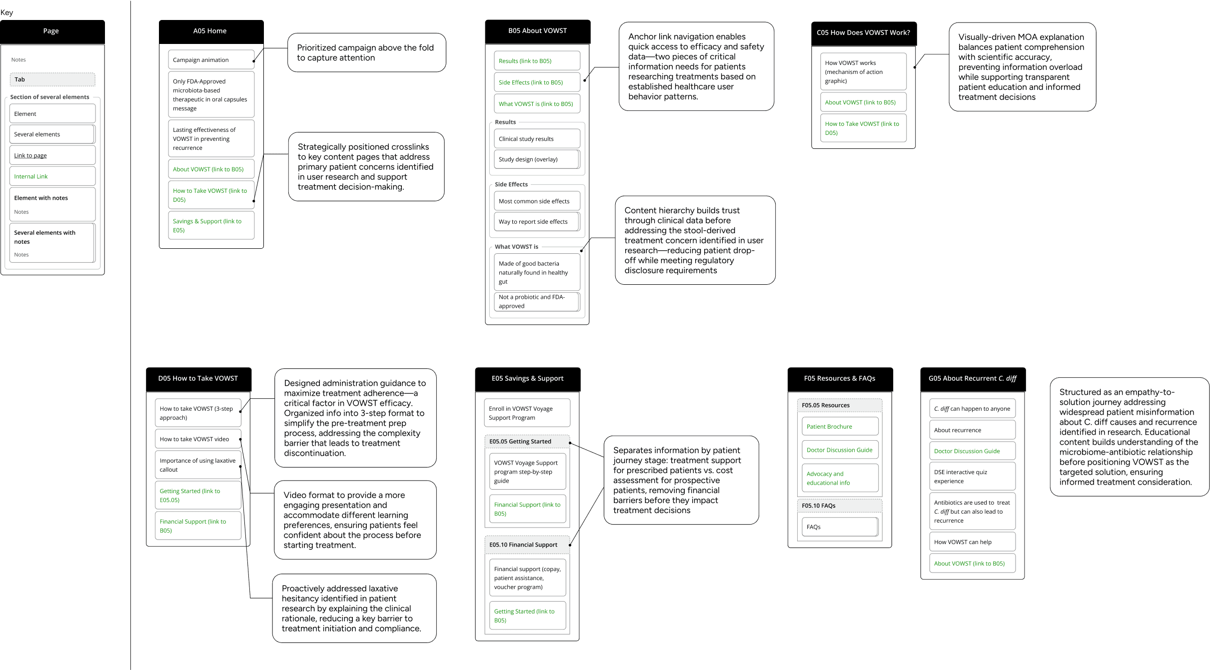
Simplified architecture with annotations

WIREFRAMES & PROTOTYPES
Demonstrating critical interactions to align stakeholders and drive decisions
(If you'd like to see the prototype, please send me an email.)
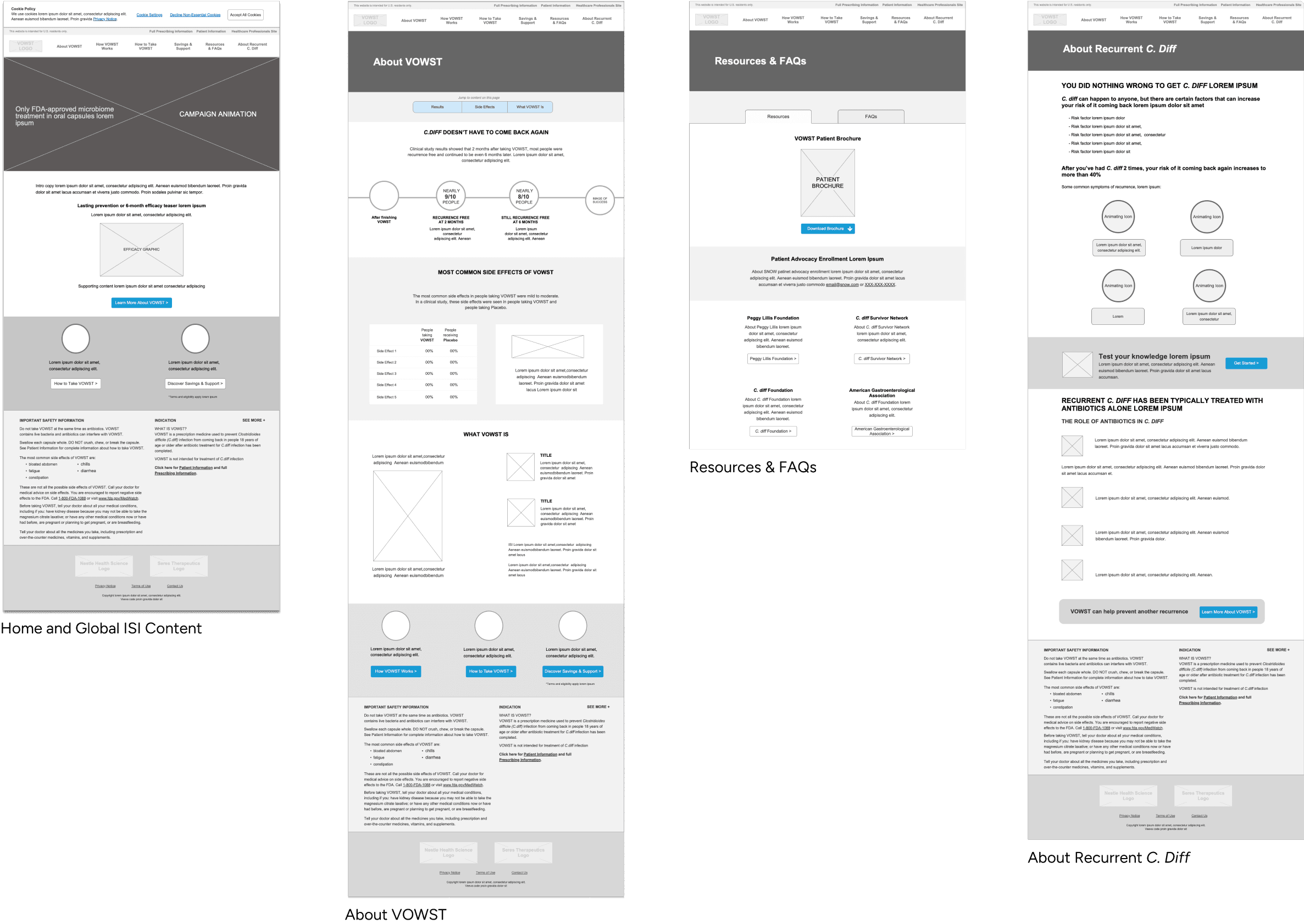
Desktop wireframes
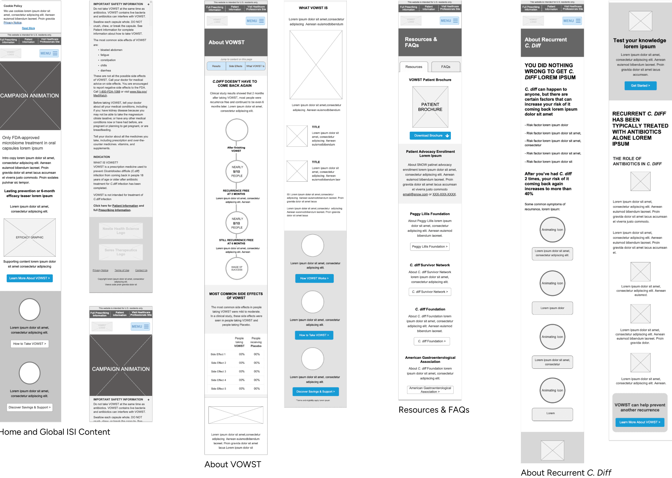
Mobile wireframes
TESTING
Usability testing revealed ideal anchor link experience
Previous research showed users struggled with anchor links, so we ran a quick A/B test to determine the most usable format for the content-heavy About VOWST page.
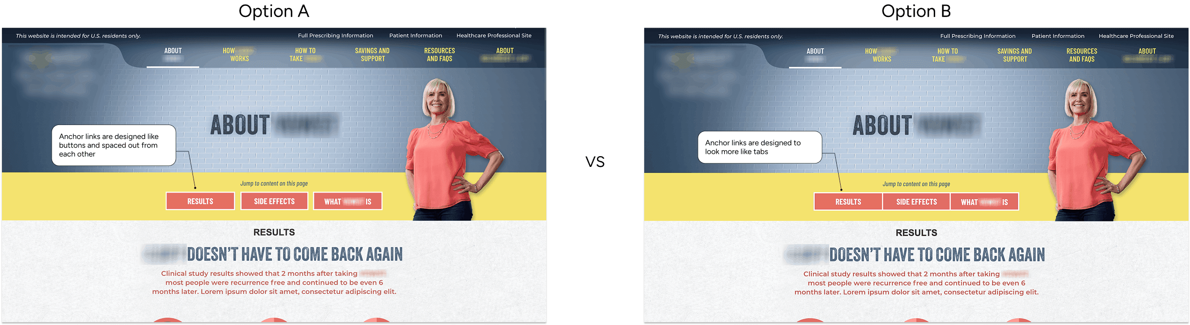
Screenshots of test prototypes: version A (left) and version B (right)
Goals
Anchor links are easily noticeable on the page
Anchor links function the way users expect them to
Having space between the buttons help users identify them
Key findings
High visibility: Red buttons on yellow background drew immediate attention
Unclear functionality: Most users expected links to open new pages/overlays rather than jump to sections
Spacing between buttons was preferred: All users from test B showed/stated that they were drawn to the buttons, a user from test 1 suggested that the buttons be spaced out from each other
DEV HANDOFF
Detailed documentation ensured efficient dev collaboration and implementation
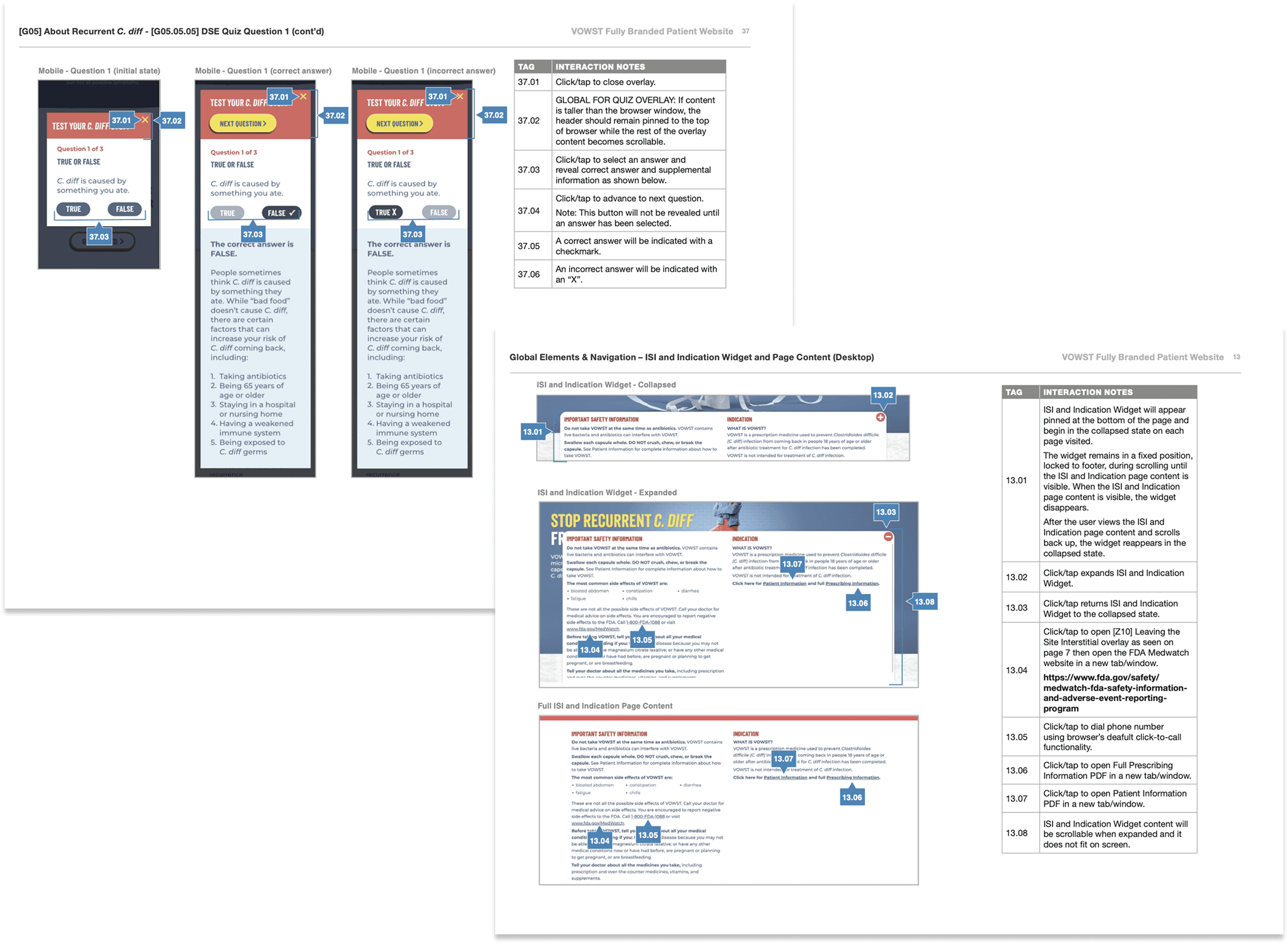
Example of functionality annotations provided to dev
SOLUTION
A patient experience that addressed user needs and business goals

Reimagined Home screen with quick access to relevant content
Goal
Empathize with users and transform "growing despair" into empowerment and action while providing easy access to pertinent information deeper in the site
Solution
Dynamic patient campaign creates emotional connection beyond static messaging
Differentiation statement highlights VOWST as a credible, first of it's kind therapeutic
Crosslinks provide strategic pathways to guide users to information most critical for decision-making
About VOWST: Proving superior efficacy and building patients’ confidence
Goal
Build confidence through clinical evidence of VOWST's safety and effectiveness and providing assurance of quality of manufacturing
Solution
Anchor link navigation helps patients to easily navigate to each topic on a dense page
Trial design explanation validating study rigor and results credibility
Comparison messaging subtly positioning against standard care limitations
Purity and quality messaging emphasizing "same good bacteria that fights bad bacteria like C. diff highlighting rigorous screening, testing, and quality control
Display FDA approval prominence establishing credibility and high safety standards
About Recurrent C. Diff: A disease education hub
Goal
Move patients from confusion to understanding about recurrence risk and microbiome role
Solution
Interactive quiz experience allowing an engaging way for users learn more about their condition
Mechanism of disease education explaining antibiotic disruption without overwhelming clinical jargon
Prominent recurrence statistics (1 in 4 face reinfection) to establish sense of urgency to treat
External advocacy links reinforcing community support
Savings & Resources: Provide comprehensive support information for prescribed and prospective patients
Goal
Ensure patients feel supported in accessing and during treatment.
Solution
Simple, step-by-step visual to provide information about what prescribed patients can expect from enrolling in the VOWST Voyage Program
Provide easy access to financial support information for those still considering treatment

REFLECTION
Learnings
Launching in uncharted territory requires a lot of flexibility: Parameters changed constantly up to launch, demanding adaptable design systems and processes.
Regulatory constraints can drive creative solutions: Working within strict accuracy requirements pushed us to find innovative ways to communicate complex information clearly.
User research is crucial even with tight timelines: Our anchor link study, though small, prevented significant usability issues and informed better design decisions.
Previous experience helped me ramp up quickly and make more informed decisions: My work on the product as a clinical research associate gave me a strong foundation in the brand and underlying science, which enabled deeper user empathy and more strategic design and content decisions.
Opportunities
Advocate earlier for testing: Due to tight timelines and budget constraints set before I joined the project, there were limited opportunities for comprehensive user testing. In future projects, I’d advocate for earlier involvement in scope planning and push for phased testing before regulatory reviews to allow more time for iteration while still ensuring compliance.
Incorporate real patient testimonials: As more patients begin using VOWST, collecting and featuring their testimonials across the site can help build trust and credibility with prospective patients. Long term, creating a patient support community could further strengthen advocacy and deepen engagement.